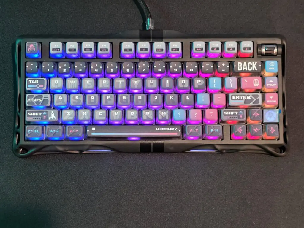
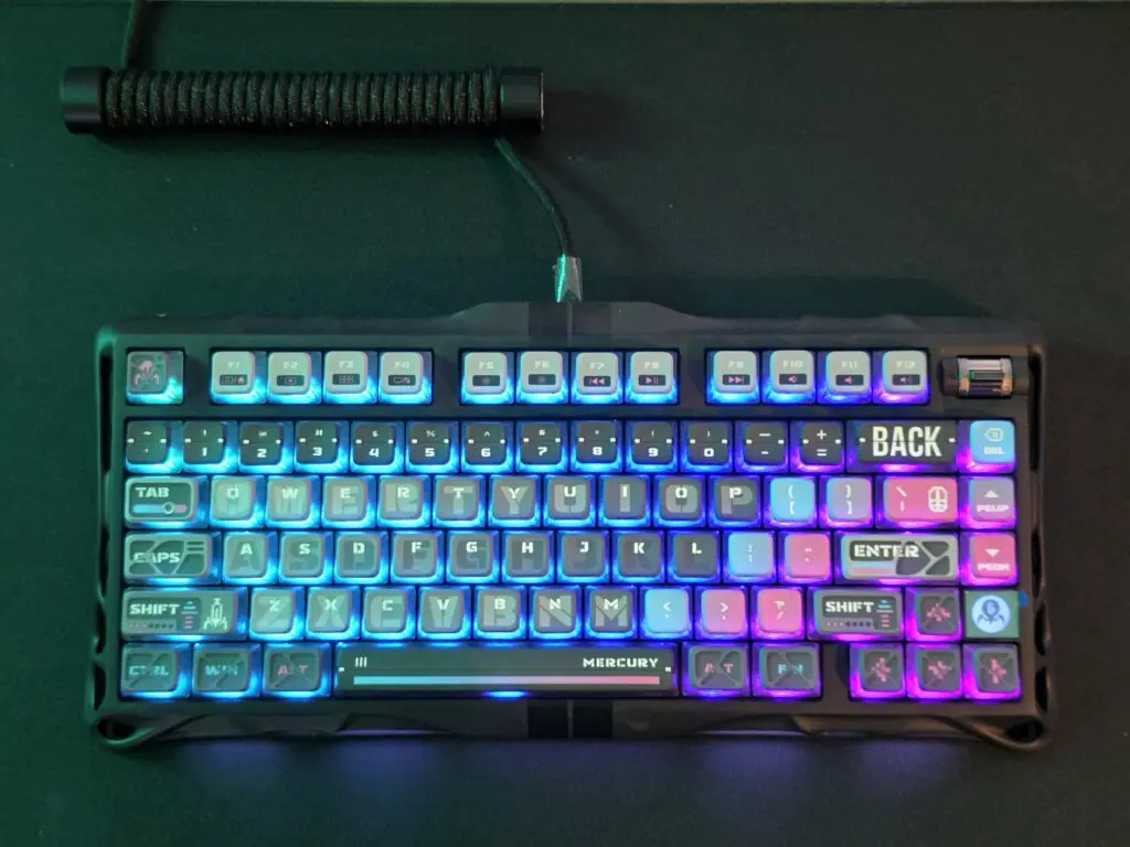
On paper, the Gravastar Mercury M1 keyboard looks like it’s come straight from the set of a futuristic sci-fi flick. The bold, angular design and industrial aesthetic work in unison to make the keyboard a real eyecatcher, and the unit – as a whole – gives off those “built for gamers, by gamers” vibes that Gravastar seem to pride themselves on. However, as good as the keyboard looks on the desk, using it is unfortunately a completely different story.
Design and First Impressions
Let’s start with the positives – and there are quite a few to enjoy. Straight out of the box, the M1 feels premium. The metal chassis is sturdy, the switches have a gratifying tactility to them, and each keystroke feels as satisfyingly precise as the last. Furthermore, the RGB lighting system is bright and beautifully executed, giving the keyboard an undeniably sleek and stylish presence.
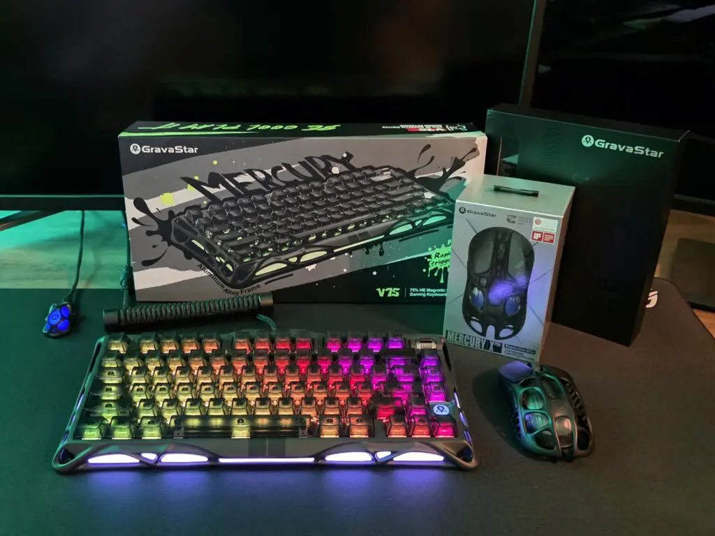
The typing experience is, in all fairness, one of the best I can recall from recent memory. The keys are smooth, consistent, and offer an ideal middle ground between clicky and cushioned. Whether gaming or typing, each press feels reassuringly solid. There’s no doubt that Gravistar have nailed that side of things.
Practically Invisible Keys Break the Experience
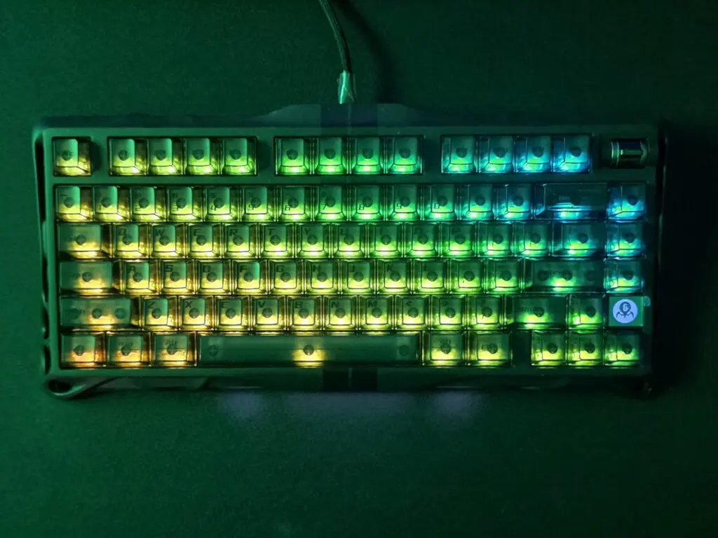
Sadly, all that premium design goes out of the proverbial window the moment you actually try and read the keys. The lettering on the factory keycaps is so faint that it’s practically invisible without an industrial strength lamp. Coming from a larger keyboard, my finger placement was completely off, and without being to identify any of the keys properly, it quickly became an exercise in frustration as opposed to function.
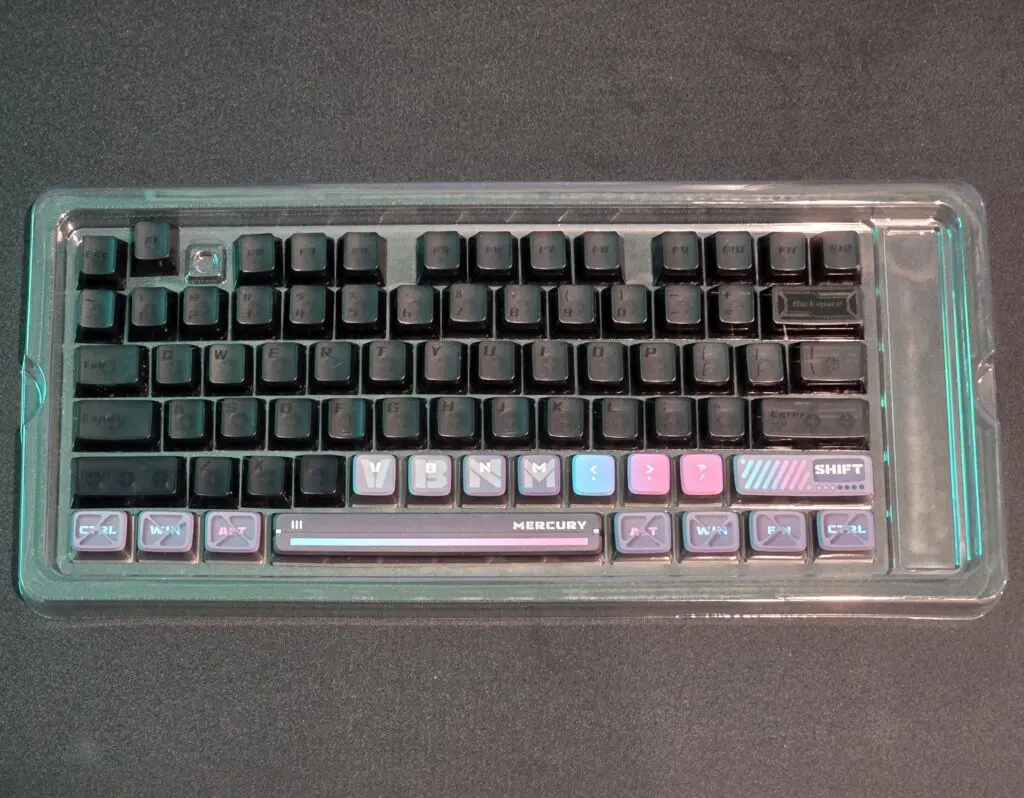
To make matters worse, Gravastar’s customer support response to this was frankly baffling. After reaching out to explain the problem, I was directed to a $50 replacement keycap set – almost as if paying extra to make a brand-spanking-new keyboard functional was a perfectly reasonable solution. Furthermore, when pressed, I was told that “no other customers had reported this problem” and that I could simply “buy keycaps from other stores”.
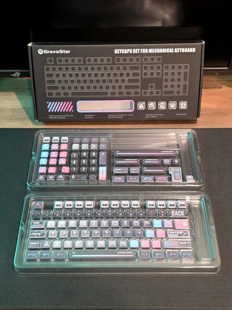
This was an incredibly disappointing response from a company that lays its very foundations in design and user experience. A premium keyboard should not require an additional purchase just to read the keys, and this level of support is dismissive, at very best.
The Gravistar Bundle
At this point, it’s perhaps worth noting that the unit I received came as part of a full and comprehensive Gravistar bundle, complete with matching accessories and themed packaging – all of which looked superb, by the way. The presentation really drove home that premium, collectible feel that the company was clearly aiming for, and it’s hard not to appreciate the effort that went into the visual design of the set.
Performance and Feel
Now, setting the visibility issue aside (if that’s even possible), the performance of the M1 is otherwise excellent. The switches are responsive, the overall build quality is superb and the keyboard feels great for both gaming and typing. Furthermore, there’s no noticeable input lag, and the wireless connection remained stable throughout testing.
Had Gravastar simply opted for legible keys (like any sane designer would), or even a more practical contrast of colors, this could easily have been a top-tier keyboard. However, as it stands, it feels like a product more designed for a display shelf than actual use.
Final Thoughts
The Gravastar Mercury M1 Keyboard is a beautiful piece of hardware that sadly stumbles and falls on one of the most fundamental aspects of usability. It feels great to type on, I admit, but if you can’t actually read the keys, the whole experience becomes a tsunami of frustration.
The poor customer support only adds salt to the wounds, suggesting that Gravastar are far more interested in upselling accessories than addressing legitimate design flaws.
It’s a real shame, because a few small changes and this could have been one of the leading keyboards of the year. However, as it stands the M1 is a classic case of style over substance.
REVIEW
OUR SCORE - 3.5
3.5
SCORE
A gorgeous but impractical keyboard that feels wonderful, yet fails the most basic usability test.


Leave a Reply