New Logo
- Thread starter Stan
- Start date
You are using an out of date browser. It may not display this or other websites correctly.
You should upgrade or use an alternative browser.
You should upgrade or use an alternative browser.
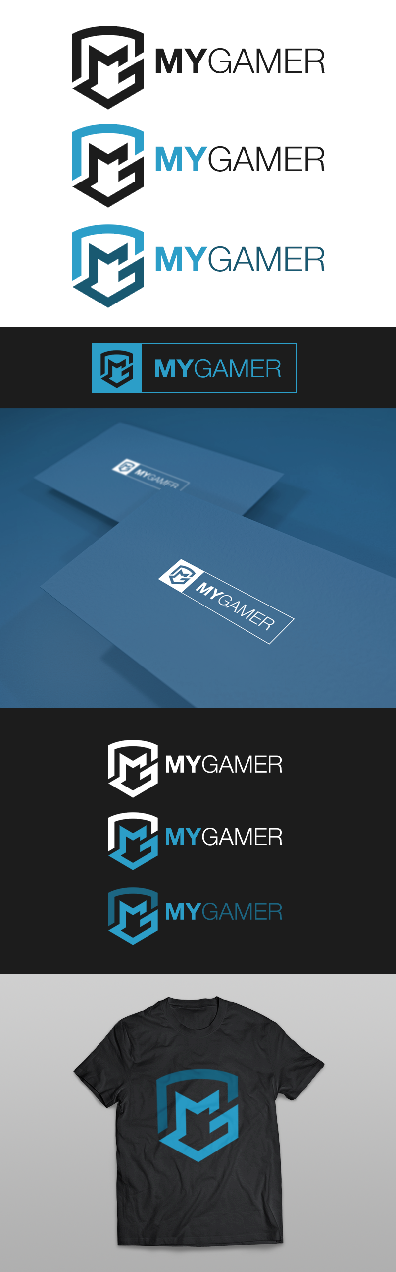

I like the logo with the Blue & Black combination to it the most, it looks quite impressive.
The all-black logo isn't bad, but I don't think its anything special.
The third logo has some poor color selections made, in my opinion. Really doesn't look right, it'd be nice to see some other color palettes used.
The all-black logo isn't bad, but I don't think its anything special.
The third logo has some poor color selections made, in my opinion. Really doesn't look right, it'd be nice to see some other color palettes used.
We need to make some of those shirts!
I thought that those shirts were already in production, they will be neat, put them at sale here at the site.
")